| Starflower Software |

| Dimlog | Dimlog manual |
Time series window
To open the Statistics window, click on the Time Series button in the Statistics view.
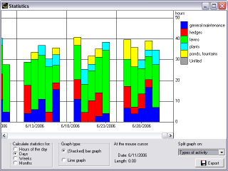
The statistics window shows the time spent during a time period. For example, you can create a graph that shows how much time is spent each week.
If you see an empty graph, there are no sessions within the filtering.
At the lower left corner, you can choose for which time period Dimlog has to calculate statistics.
If you move the mouse cursor over the graph, details are displayed below the graph, under the label "At the mouse cursor".
Stacked bar graph
You can let Dimlog split the bars on the subcategories of the current filter. At the lower right is a box to choose where to split on. If you now move with the mouse on a part of the bar in the graph, the name of the subcategory is displayed under the label "At the mouse cursor". Time totals are displayed if you move the mouse above the bar.
Line graph
Line graphs works much the same way as the stacked bar graph, except the following: If you let Dimlog split the graph, the totals of the subcategories are not added to each other, as with the stacked bar graph, but drawn as separated lines. If you move the mouse to a point of the line, the name of the subcategory is displayed under the label "At the mouse cursor".